
Retain the equity. Rebuild everything around it.
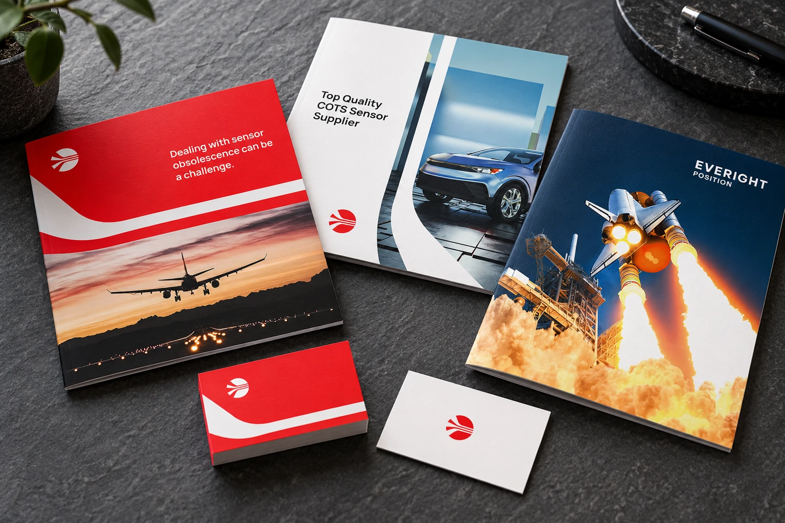
After years of ongoing content, advertising, newsletters and outsourced marketing support, the company’s growth called for a refreshed brand and website. The established color was retained to protect recognition while the rest of the system was reconsidered.
A modern industrial type system, application photography and a versatile connectivity-inspired mark created a more distinctive platform. The identity expresses motion, automation and the way many components work together as one cohesive system.